1.4.11 Non-Text Contrast (AA)
1.4.11 Non-Text Contrast (AA)
Success Criterion 1.4.11 Non-text Contrast (Level AA):
The visual presentation of the following have a contrast ratio of at least 3:1 against adjacent color(s):
- User Interface Components: Visual information required to identify user interface components and states, except for inactive components or where the appearance of the component is determined by the user agent and not modified by the author;
- Graphical Objects: Parts of graphics required to understand the content, except when a particular presentation of graphics is essential to the information being conveyed.
Intent:
This success criterion extends some of the contrast requirements for text to user interface components and non-text parts of graphics. This is meant to ensure that users with low vision can perceive parts of the screen that are not necessarily text, but still important for accessing and understanding content. This includes elements such as buttons, icons that convey information, lines in line graphs and slices in pie charts. Without sufficient contrast on buttons, users may not be able to distinguish them from the background. Additionally, users who cannot distinguish lines in a line graph, or between slices in a pie chart, cannot interpret the information.
User interface components that are inactive (not available for user interaction at the moment) do not have to meet these contrast requirements, so they may be "grayed-out" while they are inactive.
The W3C offers an in-depth explanation of this criterion in the Understanding document. This criterion relates to another criterion on Use of Color.
Exceptions:
Flags, photography, heatmaps, and other situations where changing the colors changes the meaning are exempt from this requirement.
Who it helps:
- Users with low vision who may have difficulty perceiving graphical components with poor contrast.
- Users who are colorblind who cannot perceive the differences between some colors, but can perceive the difference in contrast.
“I couldn't use the "Order Form" — there were no text boxes. After a long call
with customer service, I learned there were text box borders that were too
light for me to see.”
- Retiree with low contrast sensitivity
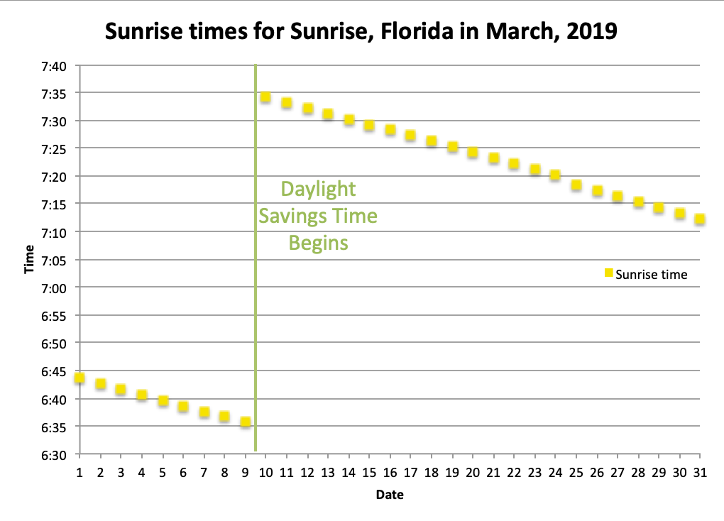
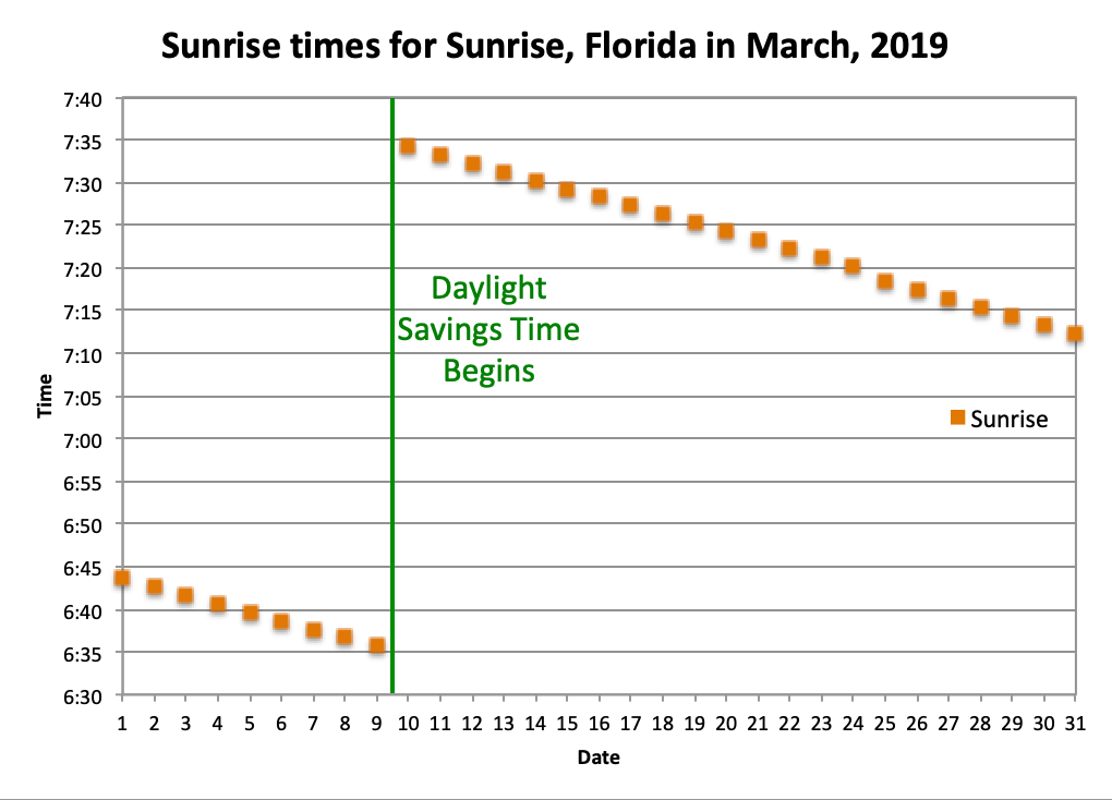
Examples:
In the example below, two charts show the change in sunrise time during the month of March. This chart contains many non-text elements that convey information, including dots denoting sunlight time on various days, lines that cross the chart to show times, and a line showing when Daylight Savings Time began. In the first chart, all of these elements do not meet contrast requirements, so some users may be unable to discern the information in the chart. In the second chart, the contrast has been increased to meet contrast requirements.