
WCAG 2.2 Updates
New Success Criteria in WCAG 2.2
Summary of Changes
WCAG 2.2 was released in October 2023. You can find the 9 new success criteria on this page, as well as within the Web Accessibility curriculum in Deque University.
Below are summaries of each new success criterion, organized by level.
Level A:
- 3.2.6 Consistent Help: Certain help mechanisms that are repeated on multiple web pages MUST occur in the same relative order to other page content, unless a change is initiated by the user.
- 3.3.7 Redundant Entry: Information previously entered by or provided to the user that is required to be entered again in the same process MUST be either auto-populated or available for the user to select, with several allowable exceptions.
Level AA:
- 2.4.11 Focus Not Obscured (Minimum): When a user interface component receives keyboard focus, the component MUST NOT be entirely hidden due to author-created content.
- 2.5.7 Dragging Movements: All functionality that uses a dragging movement for operation MUST BE achievable by a single pointer without dragging, unless dragging is essential or the functionality is determined by the user agent and not modified by the author.
- 2.5.8 Target Size (Minimum): The size of the target for pointer inputs MUST be at least 24 by 24 CSS pixels (with some allowable exceptions).
- 3.3.8 Accessible Authentication (Minimum): A cognitive function test MUST NOT be required for any step in an authentication process, unless specified criteria are met.
Level AAA:
- 2.4.12 Focus Not Obscured (Enhanced): When a user interface component receives keyboard focus, the focus indicator SHOULD NOT be hidden at all (even partially) by author-created content.
- 2.4.13 Focus Appearance: When the keyboard focus indicator is visible, an area of the focus indicator SHOULD meet specified size and color contrast requirements.
- 3.3.9 Accessible Authentication (Enhanced): A cognitive function test SHOULD NOT be required for any step in an authentication process, unless there is an alternative method without a required cognitive test or there is a mechanism to assist the user.
Changes from WCAG 2.1 to WCAG 2.2
The 2.0 and 2.1 success criteria are exactly the same (verbatim, word-for-word) in 2.2, with this exception:
- 4.1.1 Parsing is obsolete and removed from WCAG 2.2.
- Additionally, versions 2.1 and 2.0 of WCAG now include this note concerning conformance with 4.1.1 Parsing: "This Success Criterion should be considered as always satisfied for any content using HTML or XML."
- More information is in the WCAG 2 FAQ.
A Closer Look at Each New Success Criterion
New Success Criterion: 3.2.6 Consistent Help
3.2.6 Consistent Help (A)
Success Criterion 3.2.6 Consistent Help (Level A):
Certain help mechanisms that are repeated on multiple web pages MUST occur in the same relative order to other page content, unless a change is initiated by the user.
Intent:
It’s important that users can easily get help (when available) when completing tasks. Ensuring that help mechanisms are located in the same relative location from page to page makes them easy to find.
The help mechanisms covered under this rule are:
- Human contact details
- Human contact mechanism
- Self-help option
- A fully automated contact mechanism
Who it helps:
- People with cognitive or learning disabilities.
- All people benefit from easily-findable help features.
"When I need help, I can easily find the Chat option that's always in the lower right corner of the page."
- Supermarket assistant with cognitive disabilities
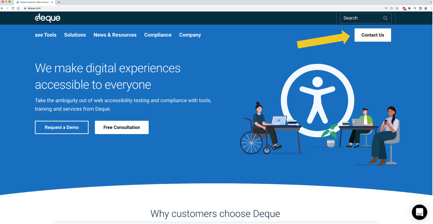
Easy-to-locate "Contact Us" button
Across all pages of the Deque website, there is a "Contact Us" link available in the top right corner.
New Success Criterion: 3.3.7 Redundant Entry
3.3.7 Redundant Entry (A)
Success Criterion 3.3.7 Redundant Entry (Level A):
Information previously entered by or provided to the user that is required to be entered again in the same process MUST be either auto-populated or available for the user to select, with several allowable exceptions.
Intent:
This rule is intended to help with the completion of multi-step processes and to reduce cognitive burden on the user. Many people are familiar with the profound frustration of long forms that require the entry of the same data in multiple places, wasting a lot of time and energy.
Exceptions:
The allowable exceptions when redundant entry may be required are when:
- re-entering the information is essential,
- the information is required to ensure the security of the content, or
- previously entered information is no longer valid.
Who it helps:
- People with cognitive disabilities.
- Users with mobility disabilities.
"Whenever I use the online app to schedule my medical appointments, it automatically fills in information that I entered in previous steps."
- Supermarket assistant with cognitive disabilities
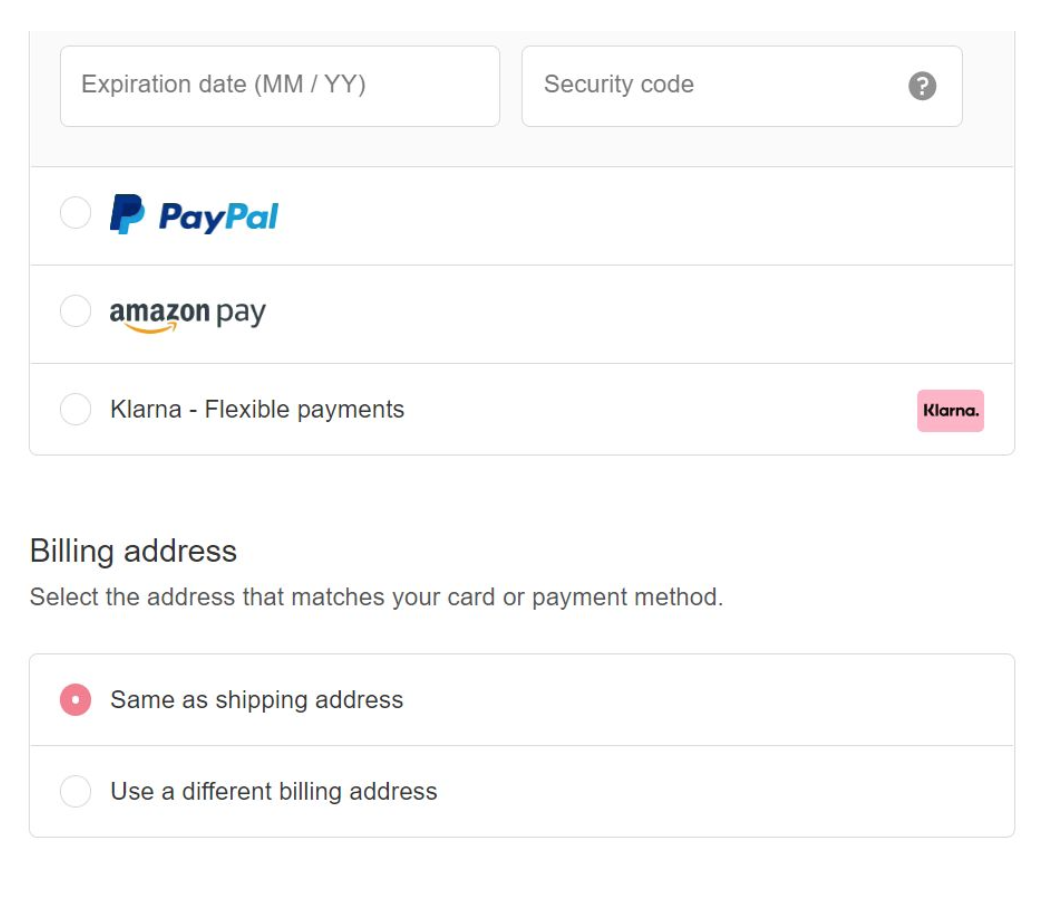
Auto-filled redundant information
This online shopping purchase process automatically assumes that the billing address is the same as the shipping address and auto-populates that data (though there is an option to change it, if the address is different).
New Success Criterion: 2.4.11 Focus Not Obscured (Minimum)
2.4.11 Focus Not Obscured (Minimum) (AA)
Success Criterion 2.4.11 Focus Not Obscured (Minimum) (Level AA):
When a user interface component receives keyboard focus, the component MUST NOT be entirely hidden due to author-created content.
Intent:
Sighted keyboard users need to know what element currently has focus. However, sometimes other author-created content may overlap the focus. For example, sticky footers, sticky headers, and non-modal dialogs. This rule requires that such content does not entirely hide the component, although it may partially hide it. Consequently, at least part of the focus indicator will also always be visible.
Ideally, the element in focus will not be overlapped by anything, but this may be complicated, considering the complexities of responsive designs.
Who it helps:
- People who rely on the keyboard. For example, those with low vision and/or mobility disabilities.
- People with attention, short term memory, or executive processes limitations.
"When I move focus to items, I can see them all."
- Reporter with repetitive stress injury who uses speech recognition software
Sticky footer that does not obscure elements
This example shows a website with a sticky footer. As a user tabs through focusable elements, they do not get obscured by the footer.
New Success Criterion: 2.5.7 Dragging Movements
2.5.7 Dragging Movements (AA)
Success Criterion 2.5.7 Dragging Movements (Level AA):
All functionality that uses a dragging movement for operation MUST BE achievable by a single pointer without dragging, unless dragging is essential or the functionality is determined by the user agent and not modified by the author.
Intent:
Not all people are able to use features such as sliders or drag-and-drop functions, or they may use assistive technology that makes tasks like dragging difficult or prone to errors.
Single pointer input operates with one point of contact on the screen. For example, single or double click or tap, or a long press.
Who it helps:
- People who struggle with performing dragging movements.
"When I click on an item in the list, I get up and down arrows and I can click those to change the order."
- Retiree with hand tremor
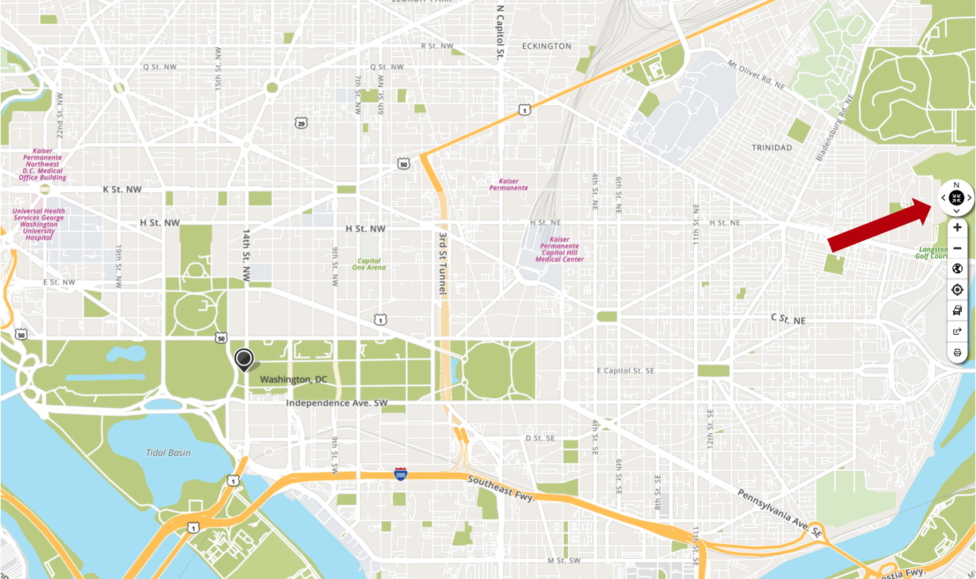
Map with buttons that supplement dragging features
This map from MapQuest allows a user to drag the view around, and you can also use North, East, South, and West buttons to move the view with your mouse, keyboard, or assistive technology device.
New Success Criterion: 2.5.8 Target Size (Minimum)
2.5.8 Target Size (Minimum) (AA)
Success Criterion 2.5.8 Target Size (Minimum) (Level AA):
The size of the target for pointer inputs MUST be at least 24 by 24 CSS pixels (with some allowable exceptions).
Intent:
Target size was previously only a level AAA rule, but now it is part of level AA requirements. This rule establishes a minimum required size (24 by 24 pixels). When possible, it's better to adhere to the AAA minimum required size (44 by 44 pixels).
Exceptions:
The allowable exceptions for this rule are:
- Spacing: The target offset is at least 24 CSS pixels to every adjacent target;
- Equivalent: The function can be achieved through a different control on the same page that has an area of at least 24 by 24 CSS pixels;
- Inline: The target is in a sentence or block of text;
- User agent control: The size of the target is determined by the user agent and is not modified by the author;
- Essential: A particular presentation of the target is essential or is legally required for the information being conveyed.
Who it helps:
- People using a touch screen.
- People who have mobility troubles such as hand tremors.
- People with large fingers.
- People who are using a device one-handed.
- People who are using a device in a shaking environment, such as on a bus.
"There is plenty of space between the buttons so I don't hit the wrong button even when I'm riding on the bumpy bus."
- Retiree with hand tremor
Large-enough buttons
These are appropriately sized buttons to apply on a page for mobile use. They are easily accessible to most touch-based users and allow easy visibility.
Here are some example buttons, both of which meet the minimum size best practices for mobile devices (view them on a mobile device for the most accurate size).
44px Submit Button
48px Submit Button
New Success Criterion: 3.3.8 Accessible Authentication (Minimum)
3.3.8 Accessible Authentication (Minimum) (AA)
Success Criterion 3.3.8 Accessible Authentication (Minimum) (Level AA):
A cognitive function test MUST NOT be required for any step in an authentication process, unless specified criteria are met.
Intent:
An example of a cognitive function test during an authentication process is remembering a password or solving a puzzle to be able to log in.
It is permissible to require such a test, but only if at least one of these is true:
- Alternative: Another authentication method is available that does not rely on a cognitive function test.
- Mechanism: A mechanism is available to assist the user in completing the cognitive function test.
- Object Recognition: The cognitive function test is to recognize objects.
- Personal Content: The cognitive function test is to identify non-text content the user provided to the website.
So for example, when requiring a password, a user could save the username and password to their browser or other password manager, in which case they don’t need to remember them. Therefore, allowing user agents to fill in these fields automatically (and not blocking this function with a script) would satisfy the "Mechanism" item in the list above.
Who it helps:
- People with cognitive disabilities related to memory, reading, numbers, or those with perception-processing limitations.
"To get into this app, I can put my e-mail address. Then I get an e-mail message, and I can click a link in the e-mail to get into the app."
- Supermarket assistant with cognitive disabilities
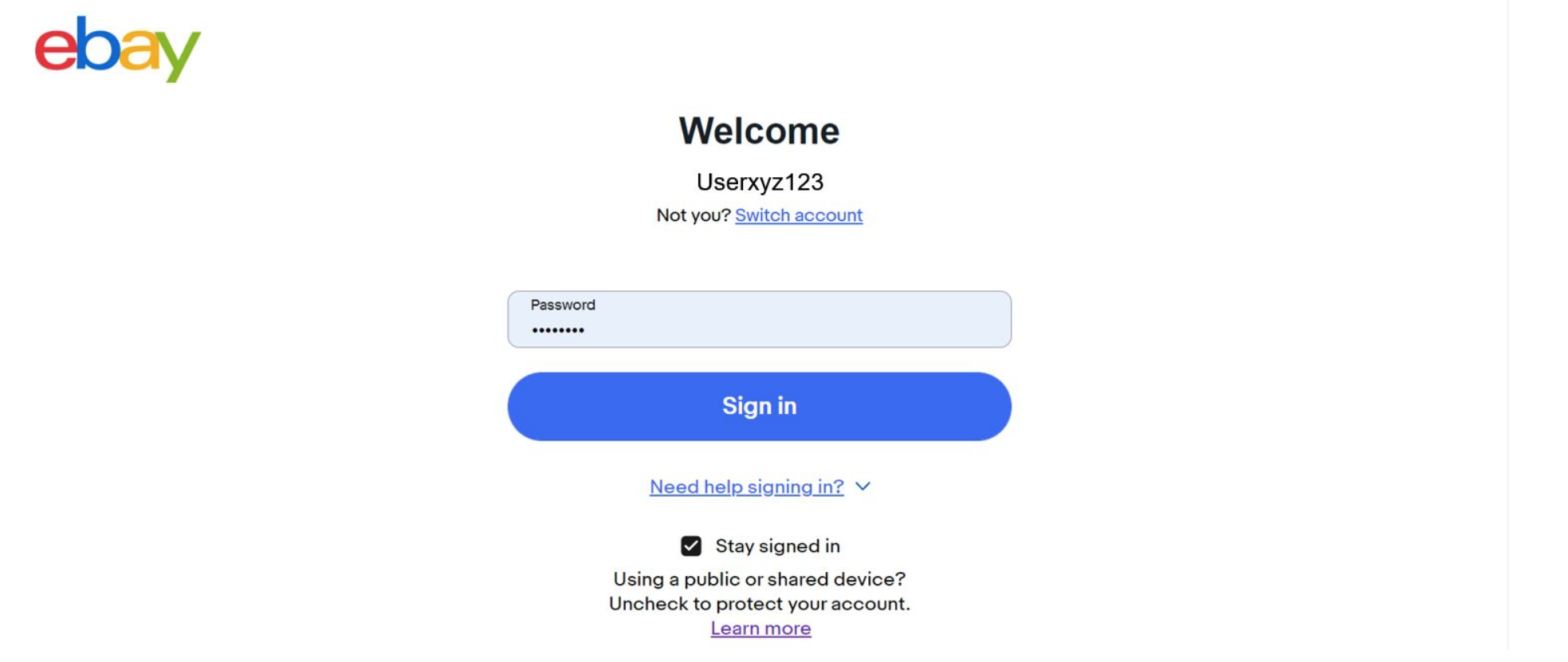
Login information saved in browser
The image below shows the eBay login screen with the username and password saved in the browser, so a user just needs to click the sign in button to log in.
New Success Criterion: 2.4.12 Focus Not Obscured (Enhanced)
2.4.12 Focus Not Obscured (Enhanced) (AAA)
Success Criterion 2.4.12 Focus Not Obscured (Enhanced) (Level AAA):
When a user interface component receives keyboard focus, the focus indicator SHOULD NOT be hidden at all (even partially) by author-created content.
Intent:
This best practice is essentially a stricter version of Success Criterion 2.4.11, which does allow for partial obstruction. Here, no obstruction at all is permitted.
Who it helps:
- People who rely on the keyboard. For example, those with low vision and/or mobility disabilities.
- People with attention, short term memory, or executive processes limitations.
"When I move focus to items, I can see them all."
- Reporter with repetitive stress injury who uses speech recognition software
Sticky footer that does not obscure elements
This example shows a website with a sticky footer. As a user tabs through focusable elements, they do not get obscured by the footer.
New Success Criterion: 2.4.13 Focus Appearance
2.4.13 Focus Appearance (AAA)
Success Criterion 2.4.13 Focus Appearance (Level AAA):
When the keyboard focus indicator is visible, an area of the focus indicator SHOULD meet specified size and color contrast requirements.
Intent:
The purpose of this rule is to define a minimum level of visibility for the focus indicator. Sighted keyboard users rely on knowing where the focus is so that they can effectively interact with user interface components.
When the keyboard focus indicator is visible, an area of the focus indicator should meet all the following:
- is at least as large as the area of a 2 CSS pixel thick perimeter of the unfocused component or sub-component, and
- has a contrast ratio of at least 3:1 between the same pixels in the focused and unfocused states.
Exceptions:
- The focus indicator is determined by the user agent and cannot be adjusted by the author, or
- The focus indicator and the indicator's background color are not modified by the author.
Who it helps:
- People who rely on the keyboard.
- People who have attention, memory, or executive processes limitations.
"I can see where the keyboard focus is as I move around a web page or app."
- Reporter with repetitive stress injury who doesn't use a mouse
Auto-filled redundant information
This example shows a Deque University link on a dark blue background, with a white focus indicator rectangle. It meets all three parts of criteria #1 outlined in the rule above.
- It encloses the user interface component (in this case, a link to Deque University).
- It has a contrast ratio of 13.37:1 (greater than 3:1) between the same pixels in the focused and unfocused states. In the unfocused state, the focus indicator is the same color as the background, which is a dark blue. In the focused state, the indicator is white. And the blue and the white have a 13.37:1 color contrast ratio.
- It has a contrast ratio of at least 3:1 against adjacent non-focus-indicator colors - the white focus indicator and the dark blue background.
Unfocused state:

Focused state:

New Success Criterion: 3.3.9 Accessible Authentication (Enhanced)
3.3.9 Accessible Authentication (Enhanced) (AAA)
Success Criterion 3.3.9 Accessible Authentication (Enhanced) (Level AAA):
A cognitive function test SHOULD NOT be required for any step in an authentication process, unless there is an alternative method without a required cognitive test or there is a mechanism to assist the user.
Intent:
This rule is simply a stricter version of Success Criterion 3.3.8 — two exceptions are allowed instead of four. To pass this rule, these exceptions may not be used: cognitive function tests related to object recognition or to personal content. Although, under this rule, it is still permissible to require a cognitive function test as long as at least one of these is true:
- Alternative: Another authentication method is available that does not rely on a cognitive function test.
- Mechanism: A mechanism is available to assist the user in completing the cognitive function test.
Who it helps:
- People with cognitive disabilities related to memory, reading, numbers, or those with perception-processing limitations.
"To get into this app, I can put my e-mail address. Then I get an e-mail message, and I can click a link in the e-mail to get into the app."
- Supermarket assistant with cognitive disabilities
Login information saved in browser
The image below shows the eBay login screen with the username and password saved in the browser, so a user just needs to click the sign in button to log in.