Carousel (based on a tabpanel)
Carousel (based on a tabpanel)
This carousel pattern is based on an ARIA tab panel pattern. Only one tab panel (carousel item) is visible at a time. There are buttons to go forward, back, or to play/pause the carousel.
Turn on a screen reader to experience this example in action.

HTML Source Code
<section id="myCarousel" class="carousel-tablist" aria-roledescription="carousel" aria-label="Various places">
<div class="carousel-inner">
<div class="controls">
<button class="rotation" type="button">
<svg width="42" height="34" version="1.1" xmlns="http://www.w3.org/2000/svg" class="svg-play">
<rect class="background" x="2" y="2" rx="5" ry="5" width="38" height="24"></rect>
<rect class="border" x="4" y="4" rx="5" ry="5" width="34" height="20"></rect>
<polygon class="pause" points="17 8 17 20"></polygon>
<polygon class="pause" points="24 8 24 20"></polygon>
<polygon class="play" points="15 8 15 20 27 14"></polygon>
</svg>
</button>
<div class="tab-wrapper">
<div role="tablist" aria-label="Slides">
<button id="carousel-tab-1" type="button" role="tab" aria-label="Slide 1" aria-selected="true" aria-controls="carousel-item-1">
<svg width="34" height="34" version="1.1" xmlns="http://www.w3.org/2000/svg">
<circle class="border" cx="16" cy="15" r="10"></circle>
<circle class="tab-background" cx="16" cy="15" r="8"></circle>
<circle class="tab" cx="16" cy="15" r="6"></circle>
</svg>
</button>
<button id="carousel-tab-2" type="button" role="tab" tabindex="-1" aria-label="Slide 2" aria-selected="false" aria-controls="carousel-item-2">
<svg width="34" height="34" version="1.1" xmlns="http://www.w3.org/2000/svg">
<circle class="border" cx="16" cy="15" r="10"></circle>
<circle class="tab-background" cx="16" cy="15" r="8"></circle>
<circle class="tab" cx="16" cy="15" r="6"></circle>
</svg>
</button>
<button id="carousel-tab-3" type="button" role="tab" tabindex="-1" aria-label="Slide 3" aria-selected="false" aria-controls="carousel-item-3">
<svg width="34" height="34" version="1.1" xmlns="http://www.w3.org/2000/svg">
<circle class="border" cx="16" cy="15" r="10"></circle>
<circle class="tab-background" cx="16" cy="15" r="8"></circle>
<circle class="tab" cx="16" cy="15" r="6"></circle>
</svg>
</button>
</div>
</div>
</div>
<div id="myCarousel-items" class="carousel-items playing" aria-live="off">
<div class="carousel-item active" id="carousel-item-1" role="tabpanel" aria-roledescription="slide" aria-label="1 of 3">
<div class="carousel-image">
<a href="#" id="carousel-image-1">
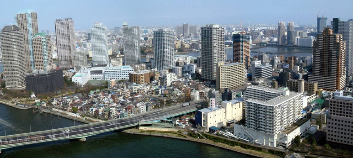
<img src="/assets/js/patterns/images/tempimage01.jpeg" alt="New York City Skyline">
</a>
</div>
<div class="carousel-caption">
<h2 role="none" >
<a href="#"> New York City Skyline </a>
</h2>
</div>
</div>
<div class="carousel-item" id="carousel-item-2" role="tabpanel" aria-roledescription="slide" aria-label="2 of 3">
<div class="carousel-image">
<a href="#" id="carousel-image-2">
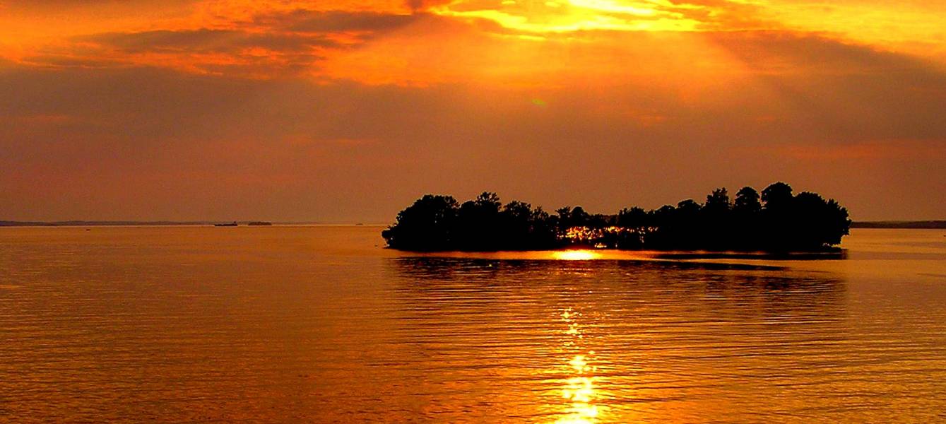
<img src="/assets/js/patterns/images/tempimage02.jpeg" alt="Beach Sunset, California ">
</a>
</div>
<div class="carousel-caption">
<h2 role="none" >
<a href="#"> Beach Sunset, California </a>
</h2>
</div>
</div>
<div class="carousel-item" id="carousel-item-3" role="tabpanel" aria-roledescription="slide" aria-label="3 of 3">
<div class="carousel-image">
<a href="#!" id="carousel-image-3">
<img src="/assets/js/patterns/images/tempimage03.jpeg" alt="Roman statue, Italy ">
</a>
</div>
<div class="carousel-caption">
<h2 role="none" >
<a href="#"> Roman statue, Italy </a>
</h2>
</div>
</div>
</div>
</div>
</section>
<div class="col-sm-1"></div>
<!---
This component has been adapted from an example provided by the W3C, in accordance with the W3C Software and Document License https://www.w3.org/copyright/software-license-2023/
-->
JavaScript Source Code
'use strict';

// takes options object: { accessibleCaptions: boolean, autoplay: boolean, playButton: boolean }
// defaults are: { accessibleCaptions: true, autoplay: false, playButton: true }

var CarouselTablist = function (node, options) {
  // merge passed options with defaults
  options = Object.assign(
    { moreaccessible: false, paused: false, norotate: false },
    options || {}
  );

  // a prefers-reduced-motion user setting must always override autoplay
  var hasReducedMotion = window.matchMedia('(prefers-reduced-motion: reduce)');
  if (hasReducedMotion.matches) {
    options.paused = true;
  }

  /* DOM properties */
  this.domNode = node;

  this.tablistNode = node.querySelector('[role=tablist]');
  this.containerNode = node.querySelector('.carousel-items');

  this.tabNodes = [];
  this.tabpanelNodes = [];

  this.liveRegionNode = node.querySelector('.carousel-items');
  this.pausePlayButtonNode = document.querySelector(
    '.carousel-tablist .controls button.rotation'
  );

  this.playLabel = 'Start automatic slide show';
  this.pauseLabel = 'Stop automatic slide show';

  /* State properties */
  this.hasUserActivatedPlay = false; // set when the user activates the play/pause button
  this.isAutoRotationDisabled = options.norotate; // This property for disabling auto rotation
  this.isPlayingEnabled = !options.paused; // This property is also set in updatePlaying method
  this.timeInterval = 5000; // length of slide rotation in ms
  this.currentIndex = 0; // index of current slide
  this.slideTimeout = null; // save reference to setTimeout

  // initialize tabs
  this.tablistNode.addEventListener('focusin', this.handleTabFocus.bind(this));
  this.tablistNode.addEventListener('focusout', this.handleTabBlur.bind(this));

  var nodes = node.querySelectorAll('[role="tab"]');

  for (var i = 0; i < nodes.length; i++) {
    var n = nodes[i];

    this.tabNodes.push(n);

    n.addEventListener('keydown', this.handleTabKeydown.bind(this));
    n.addEventListener('click', this.handleTabClick.bind(this));

    // initialize tabpanels

    var tabpanelNode = document.getElementById(n.getAttribute('aria-controls'));

    if (tabpanelNode) {
      this.tabpanelNodes.push(tabpanelNode);

      // support stopping rotation when any element receives focus in the tabpanel
      tabpanelNode.addEventListener(
        'focusin',
        this.handleTabpanelFocusIn.bind(this)
      );
      tabpanelNode.addEventListener(
        'focusout',
        this.handleTabpanelFocusOut.bind(this)
      );

      var imageLink = tabpanelNode.querySelector('.carousel-image a');

      if (imageLink) {
        imageLink.addEventListener(
          'focus',
          this.handleImageLinkFocus.bind(this)
        );
        imageLink.addEventListener('blur', this.handleImageLinkBlur.bind(this));
      }
    } else {
      this.tabpanelNodes.push(null);
    }
  }

  // Pause Button
  if (this.pausePlayButtonNode) {
    this.pausePlayButtonNode.addEventListener(
      'click',
      this.handlePausePlayButtonClick.bind(this)
    );
  }

  // Handle hover events
  this.domNode.addEventListener('mouseover', this.handleMouseOver.bind(this));
  this.domNode.addEventListener('mouseout', this.handleMouseOut.bind(this));

  // initialize behavior based on options

  this.enableOrDisableAutoRotation(options.norotate);
  this.updatePlaying(!options.paused && !options.norotate);
  this.setAccessibleStyling(options.moreaccessible);
  this.rotateSlides();
};

/* Public function to disable/enable rotation and if false, hide pause/play button*/
CarouselTablist.prototype.enableOrDisableAutoRotation = function (disable) {
  this.isAutoRotationDisabled = disable;
  this.pausePlayButtonNode.hidden = disable;
};

/* Public function to update controls/caption styling */
CarouselTablist.prototype.setAccessibleStyling = function (accessible) {
  if (accessible) {
    this.domNode.classList.add('carousel-tablist-moreaccessible');
  } else {
    this.domNode.classList.remove('carousel-tablist-moreaccessible');
  }
};

CarouselTablist.prototype.hideTabpanel = function (index) {
  var tabNode = this.tabNodes[index];
  var panelNode = this.tabpanelNodes[index];

  tabNode.setAttribute('aria-selected', 'false');
  tabNode.setAttribute('tabindex', '-1');

  if (panelNode) {
    panelNode.classList.remove('active');
  }
};

CarouselTablist.prototype.showTabpanel = function (index, moveFocus) {
  var tabNode = this.tabNodes[index];
  var panelNode = this.tabpanelNodes[index];

  tabNode.setAttribute('aria-selected', 'true');
  tabNode.removeAttribute('tabindex');

  if (panelNode) {
    panelNode.classList.add('active');
  }

  if (moveFocus) {
    tabNode.focus();
  }
};

CarouselTablist.prototype.setSelectedTab = function (index, moveFocus) {
  if (index === this.currentIndex) {
    return;
  }
  this.currentIndex = index;

  for (var i = 0; i < this.tabNodes.length; i++) {
    this.hideTabpanel(i);
  }

  this.showTabpanel(index, moveFocus);
};

CarouselTablist.prototype.setSelectedToPreviousTab = function (moveFocus) {
  var nextIndex = this.currentIndex - 1;

  if (nextIndex < 0) {
    nextIndex = this.tabNodes.length - 1;
  }

  this.setSelectedTab(nextIndex, moveFocus);
};

CarouselTablist.prototype.setSelectedToNextTab = function (moveFocus) {
  var nextIndex = this.currentIndex + 1;

  if (nextIndex >= this.tabNodes.length) {
    nextIndex = 0;
  }

  this.setSelectedTab(nextIndex, moveFocus);
};

CarouselTablist.prototype.rotateSlides = function () {
  if (!this.isAutoRotationDisabled) {
    if (
      (!this.hasFocus && !this.hasHover && this.isPlayingEnabled) ||
      this.hasUserActivatedPlay
    ) {
      this.setSelectedToNextTab(false);
    }
  }

  this.slideTimeout = setTimeout(
    this.rotateSlides.bind(this),
    this.timeInterval
  );
};

CarouselTablist.prototype.updatePlaying = function (play) {
  this.isPlayingEnabled = play;

  if (play) {
    this.pausePlayButtonNode.setAttribute('aria-label', this.pauseLabel);
    this.pausePlayButtonNode.classList.remove('play');
    this.pausePlayButtonNode.classList.add('pause');
    this.liveRegionNode.setAttribute('aria-live', 'off');
  } else {
    this.pausePlayButtonNode.setAttribute('aria-label', this.playLabel);
    this.pausePlayButtonNode.classList.remove('pause');
    this.pausePlayButtonNode.classList.add('play');
    this.liveRegionNode.setAttribute('aria-live', 'polite');
  }
};

/* Event Handlers */

CarouselTablist.prototype.handleImageLinkFocus = function () {
  this.liveRegionNode.classList.add('focus');
};

CarouselTablist.prototype.handleImageLinkBlur = function () {
  this.liveRegionNode.classList.remove('focus');
};

CarouselTablist.prototype.handleMouseOver = function (event) {
  if (!this.pausePlayButtonNode.contains(event.target)) {
    this.hasHover = true;
  }
};

CarouselTablist.prototype.handleMouseOut = function () {
  this.hasHover = false;
};

/* EVENT HANDLERS */

CarouselTablist.prototype.handlePausePlayButtonClick = function () {
  this.hasUserActivatedPlay = !this.isPlayingEnabled;
  this.updatePlaying(!this.isPlayingEnabled);
};

/* Event Handlers for Tabs*/

CarouselTablist.prototype.handleTabKeydown = function (event) {
  var flag = false;

  switch (event.key) {
    case 'ArrowRight':
      this.setSelectedToNextTab(true);
      flag = true;
      break;

    case 'ArrowLeft':
      this.setSelectedToPreviousTab(true);
      flag = true;
      break;

    case 'Home':
      this.setSelectedTab(0, true);
      flag = true;
      break;

    case 'End':
      this.setSelectedTab(this.tabNodes.length - 1, true);
      flag = true;
      break;

    default:
      break;
  }

  if (flag) {
    event.stopPropagation();
    event.preventDefault();
  }
};

CarouselTablist.prototype.handleTabClick = function (event) {
  var index = this.tabNodes.indexOf(event.currentTarget);
  this.setSelectedTab(index, true);
};

CarouselTablist.prototype.handleTabFocus = function () {
  this.tablistNode.classList.add('focus');
  this.liveRegionNode.setAttribute('aria-live', 'polite');
  this.hasFocus = true;
};

CarouselTablist.prototype.handleTabBlur = function () {
  this.tablistNode.classList.remove('focus');
  if (this.playState) {
    this.liveRegionNode.setAttribute('aria-live', 'off');
  }

  this.hasFocus = false;
};

/* Event Handlers for Tabpanels*/

CarouselTablist.prototype.handleTabpanelFocusIn = function () {
  this.hasFocus = true;
};

CarouselTablist.prototype.handleTabpanelFocusOut = function () {
  this.hasFocus = false;
};

/* Initialize Carousel Tablists and options */

window.addEventListener(
  'load',
  function () {
    var carouselEls = document.querySelectorAll('.carousel-tablist');
    var carousels = [];

    // set example behavior based on
    // default setting of the checkboxes and the parameters in the URL
    // update checkboxes based on any corresponding URL parameters
    var checkboxes = document.querySelectorAll(
      '.carousel-options input[type=checkbox]'
    );
    var urlParams = new URLSearchParams(location.search);
    var carouselOptions = {};

    // initialize example features based on
    // default setting of the checkboxes and the parameters in the URL
    // update checkboxes based on any corresponding URL parameters
    checkboxes.forEach(function (checkbox) {
      var checked = checkbox.checked;

      if (urlParams.has(checkbox.value)) {
        var urlParam = urlParams.get(checkbox.value);
        if (typeof urlParam === 'string') {
          checked = urlParam === 'true';
          checkbox.checked = checked;
        }
      }

      carouselOptions[checkbox.value] = checkbox.checked;
    });

    carouselEls.forEach(function (node) {
      carousels.push(new CarouselTablist(node, carouselOptions));
    });

    // add change event to checkboxes
    checkboxes.forEach(function (checkbox) {
      var updateEvent;
      switch (checkbox.value) {
        case 'moreaccessible':
          updateEvent = 'setAccessibleStyling';
          break;
        case 'norotate':
          updateEvent = 'enableOrDisableAutoRotation';
          break;
      }

      // update the carousel behavior and URL when a checkbox state changes
      checkbox.addEventListener('change', function (event) {
        urlParams.set(event.target.value, event.target.checked + '');
        window.history.replaceState(
          null,
          '',
          window.location.pathname + '?' + urlParams
        );

        if (updateEvent) {
          carousels.forEach(function (carousel) {
            carousel[updateEvent](event.target.checked);
          });
        }
      });
    });
  },
  false
);

//This component has been adapted from an example provided by the W3C, in accordance with the W3C Software and Document License https://www.w3.org/copyright/software-license-2023/
CSS Source Code
/*
  Carousel — Restyled
  Deque University ARIA Component

  This component has been adapted from an example provided by the W3C,
  in accordance with the W3C Software and Document License
  https://www.w3.org/copyright/software-license-2023/
*/

:root {
  --dqu-interactive: #2e5f7a;
  --dqu-bg-secondary: #f6f3ed;
  --dqu-border-secondary: #8c827d;
  --dqu-text-primary: #21201e;
  --dqu-font-family: "Noto Sans", sans-serif;
}

img.reload {
  padding: 0.25em;
  display: block-inline;
  position: relative;
  top: 6px;
  height: 0.9em;
}

.carousel-tablist {
  background-color: var(--dqu-bg-secondary);
  max-width: 900px;
  font-family: var(--dqu-font-family);
  border-radius: 12px;
  overflow: hidden;
  box-shadow: 0 2px 12px rgba(0, 0, 0, 0.08);
}

.carousel-tablist .carousel-inner {
  position: relative;
}

.carousel-tablist .carousel-items {
  padding: 5px;
}

.carousel-tablist .carousel-items.focus {
  padding: 2px;
  border: solid 3px var(--dqu-interactive);
  border-radius: 12px;
}

.carousel-tablist .carousel-item {
  display: none;
  max-height: 400px;
  max-width: 900px;
  position: relative;
  overflow: hidden;
  width: 100%;
}

.carousel-tablist .carousel-item.active {
  display: block;
}

.carousel-tablist .carousel-item .carousel-image a img {
  height: 100%;
  width: 100%;
  border-radius: 10px;
}

.carousel-tablist .carousel-item .carousel-caption a {
  cursor: pointer;
  text-decoration: underline;
  color: #fff;
  font-weight: 600;
  font-family: var(--dqu-font-family);
}

.carousel-tablist .carousel-item .carousel-caption a,
.carousel-tablist .carousel-item .carousel-caption span.contrast {
  margin: 0;
  padding: 6px 10px;
  display: inline-block;
  background-color: rgb(0 0 0 / 40%);
  border-radius: 5px;
  border: 0 solid transparent;
  font-size: 1.1rem;
}

.carousel-tablist-moreaccessible .carousel-items .carousel-image a {
  display: block;
  margin: 0;
  padding: 5px;
  text-decoration: none;
  border: none;
}

.carousel-tablist-moreaccessible .carousel-item .carousel-caption a {
  display: inline-block;
  margin: 0;
  padding: 6px;
  color: var(--dqu-text-primary);
  background-color: transparent;
  border: none;
  border-radius: 5px;
}

.carousel-tablist-moreaccessible .carousel-item .carousel-caption span.contrast,
.carousel-tablist-moreaccessible
  .carousel-item
  .carousel-caption
  span.contrast:hover {
  background-color: transparent;
}

.carousel-tablist .carousel-item .carousel-caption a:hover,
.carousel-tablist .carousel-item .carousel-caption span.contrast:hover {
  background-color: rgb(0 0 0 / 70%);
  border-radius: 5px;
}

.carousel-tablist .carousel-item .carousel-caption a:focus {
  padding: 4px 8px;
  border: 2px solid #fff;
  background-color: rgb(0 0 0 / 70%);
  outline: none !important;
  color: #fff;
  border-radius: 5px;
}

.carousel-tablist .carousel-item .carousel-caption p {
  font-size: 1em;
  line-height: 1.5;
  margin-bottom: 0;
  font-family: var(--dqu-font-family);
}

.carousel-tablist .carousel-item .carousel-caption {
  position: absolute;
  right: 0;
  bottom: 0;
  left: 0;
  padding: 40px 15% 16px;
  color: #fff;
  text-align: center;
  background: linear-gradient(to top, rgba(0, 0, 0, 0.6) 0%, transparent 100%);
  border-radius: 0 0 10px 10px;
}

/* Shared CSS for Pause and Tab Controls */

.carousel-tablist .controls {
  box-sizing: border-box;
  position: absolute;
  top: 1em;
  z-index: 10;
  display: flex;
  width: 100%;
  padding: 0.25em 1.25em 0;
}

.carousel-tablist .tab-wrapper {
  flex: 1 1 auto;
  height: 30px;
  text-align: center;
}

/* SVG Controls */

.carousel-tablist .rotation {
  flex: 0 0 auto;
  height: 30px;
  padding: 0;
  background-color: transparent;
  border: none;
  outline: none;
  z-index: 10;
}

.carousel-tablist .svg-play .background {
  stroke: black;
  fill: black;
  stroke-width: 1px;
  opacity: 0.6;
}

.carousel-tablist .svg-play .border {
  fill: transparent;
  stroke: transparent;
  stroke-width: 2px;
}

.carousel-tablist .svg-play .pause {
  stroke-width: 4;
  fill: transparent;
  stroke: transparent;
}

.carousel-tablist .svg-play .play {
  stroke-width: 1;
  fill: transparent;
  stroke: transparent;
}

.carousel-tablist .pause .svg-play .pause,
.carousel-tablist .play .svg-play .play {
  fill: white;
  stroke: white;
}

.carousel-tablist .rotation:focus,
.carousel-tablist .rotation:hover {
  outline: none !important;
}

.carousel-tablist .rotation:focus .svg-play .background,
.carousel-tablist .rotation:hover .svg-play .background {
  fill: var(--dqu-interactive);
  stroke: var(--dqu-interactive);
  opacity: 1;
}

.carousel-tablist .rotation:focus .svg-play .border,
.carousel-tablist .rotation:hover .svg-play .border {
  stroke: white;
}

/* Shared CSS for Tabs */

.carousel-tablist [role="tablist"] {
  box-sizing: border-box;
  border: 0 transparent solid;
  border-radius: 13px;
  display: inline-block;
  padding-top: 2px;
  height: 30px;
  background-color: rgb(0 0 0 / 65%);
}

.carousel-tablist [role="tablist"].focus {
  border-width: 2px;
  border-color: white;
  padding-top: 0;
  background-color: var(--dqu-interactive);
}

.carousel-tablist [role="tab"] {
  position: relative;
  top: -2px;
  padding: 0;
  margin: 0 2px;
  background-color: transparent;
  border: none;
  outline: none !important;
  width: 36px;
  cursor: pointer;
}

.carousel-tablist [role="tab"] circle.border {
  display: none;
  z-index: 12;
}

.carousel-tablist [role="tab"] circle.tab {
  z-index: 16;
}

.carousel-tablist [role="tab"] circle.tab-background {
  stroke: rgba(255, 255, 255, 0.5);
  fill: black;
  stroke-width: 2px;
  opacity: 0.6;
  z-index: 14;
}

.carousel-tablist [role="tab"] circle.tab,
.carousel-tablist [role="tab"] circle.border {
  stroke: white;
  fill: transparent;
  stroke-width: 2px;
}

.carousel-tablist-moreaccessible [role="tab"] circle.tab-background {
  z-index: 16;
}

.carousel-tablist-moreaccessible [role="tab"] circle.tab {
  z-index: 18;
}

.carousel-tablist [role="tab"][aria-selected="true"] circle.tab {
  fill: white;
}

.carousel-tablist-moreaccessible [role="tab"] circle.border {
  z-index: 14;
}

.carousel-tablist [role="tab"]:focus circle.border {
  display: block;
  fill: var(--dqu-interactive);
  stroke: #fff;
}

.carousel-tablist [role="tablist"].focus circle.tab-background {
  stroke: var(--dqu-interactive);
  fill: var(--dqu-interactive);
}

.carousel-tablist [role="tab"]:hover circle.tab-background {
  fill: white;
  stroke: white;
  opacity: 1;
}

.carousel-tablist [role="tab"]:hover circle.border,
.carousel-tablist [role="tab"]:hover circle.tab {
  fill: var(--dqu-interactive);
  stroke: var(--dqu-interactive);
  opacity: 1;
}

.carousel-tablist [role="tab"][aria-selected="true"]:hover circle.tab {
  fill: white;
}

/* More accessible carousel styles */

.carousel-tablist-moreaccessible {
  padding: 0;
  margin: 0;
  position: relative;
  border: var(--dqu-border-secondary) solid 2px;
  border-radius: 8px;
}

.carousel-tablist-moreaccessible .carousel-items,
.carousel-tablist-moreaccessible .carousel-items.focus {
  padding: 0;
  border: none;
}

.carousel-tablist-moreaccessible .carousel-items.focus .carousel-image a {
  padding: 2px;
  border: 3px solid var(--dqu-interactive);
}

/* More accessible caption styling */

.carousel-tablist-moreaccessible .carousel-item {
  padding: 0;
  margin: 0;
  max-height: none;
}

.carousel-tablist-moreaccessible .carousel-item .carousel-caption {
  position: static;
  padding: 0;
  margin: 0;
  height: 60px;
  color: var(--dqu-text-primary);
  font-family: var(--dqu-font-family);
}

.carousel-tablist-moreaccessible .carousel-item .carousel-caption p {
  padding: 0;
  margin: 0;
}

.carousel-tablist-moreaccessible .carousel-item .carousel-caption h3 {
  font-size: 1.1em;
  padding: 0;
  margin: 0;
  font-family: var(--dqu-font-family);
}

.carousel-tablist-moreaccessible .carousel-item .carousel-caption a:hover {
  background-color: rgb(0 0 0 / 20%);
}

.carousel-tablist-moreaccessible .carousel-item .carousel-caption a:focus {
  padding: 4px;
  border: 2px solid var(--dqu-interactive);
  background-color: transparent;
  color: var(--dqu-text-primary);
  outline: none !important;
}

/* Shared CSS for Pause and Tab Controls */

.carousel-tablist-moreaccessible .controls {
  position: relative;
  top: 0;
  left: 0;
  padding: 0.25em 0.25em 0;
}

/* Shared CSS for Tabs */

.carousel-tablist-moreaccessible [role="tab"] {
  z-index: 20;
}

@media screen and (max-width: 500px) {
  .carousel-tablist .carousel-item .carousel-caption {
    padding: 0px;
  }
  .carousel-caption h2 { font-size: 12px; margin: 0px; }
}